
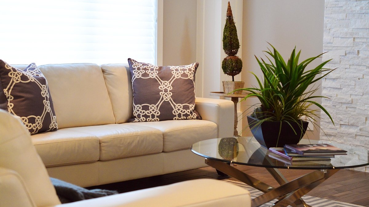
A lampshade is not just a finishing touch. It is a colour filter that sits between your bulb and your walls, changing how a room feels every evening. Choose well, and a cool grey sitting room becomes inviting rather than clinical. Choose poorly, and a warm terracotta bedroom can feel frantic. The good news is that the rules are simple: cool paint colours suit cream, linen or grey shades, while warm walls pair beautifully with amber or brass tones. Get that relationship right, and texture, scale and bulb choice fall into place more easily.
This is not about matching shades to paint exactly. It is about flattering the light that bounces around the room.
Cool paint colours include soft blues, blue-greys, sage greens, lilacs, and cool neutrals. They are calming and crisp in daylight, but under artificial light they can turn slightly icy. A stark white lampshade will amplify that chill. Instead, reach for shades that add a whisper of warmth without fighting the wall colour.
Cream is the most forgiving choice. A cream drum or empire shade softens the blue undertone in a cool grey wall, making the room feel gently lit rather than surgical. Linen is similarly effective: its natural slub and slightly off-white tone reads as warm without being yellow. If you want to lean into the coolness, choose a grey shade—but pick one a shade or two lighter than the wall, not darker, or the lamp will disappear into a murky pool.
Avoid brilliant white shades on cool walls unless you want a sharp, gallery-like effect.
Warm paint colours—terracotta, ochre, clay pink, mustard, and warm neutrals like biscuit and caramel—already glow under lamplight. They do not need a shade that adds more heat, but they do benefit from a shade that harmonises rather than competes. Amber, brass, honey, and copper tones are the natural partners here.
An amber glass shade, for example, turns a warm wall into a golden retreat. A brass shade with an aged patina does something similar: it reflects the wall colour back with a mellow, metallic warmth. If you prefer fabric, look for shades in ochre, rust, or toasted linen. These colours sit in the same family as your walls, so the lamp feels built in rather than bolted on.
The mistake to avoid is a cool white or pale grey shade on a warm wall. It creates a jarring edge—like a cold splash of water in a warm bath. For most homes, harmony is more restful.
Many UK homes are painted in greige, taupe, mushroom, or the ubiquitous warm grey. These colours are neither fully cool nor fully warm, which makes them wonderfully flexible—but also easy to get wrong. The trick is to identify the dominant undertone. Hold a piece of white paper against the wall in daylight. If the wall looks pinkish or yellowish next to it, it is warm. If it looks bluish or greenish, it is cool.
For cool-leaning greige, choose a linen or pale grey shade. For warm-leaning greige, choose cream, oatmeal, or a soft amber. If you truly cannot tell, a mid-tone linen shade is the safest bet. It sits in the middle and flatters almost everything.
Do not forget the bulb. A warm white bulb (2700K) will make any shade look warmer; a cool white bulb (4000K) will make it look cooler. If you are unsure about a shade, test it with the bulb you actually use in that lamp. That single step prevents most disappointments.
The colour of the shade is only half the story. The lining inside matters too. A white lining bounces more light outwards and keeps colours truer. A gold or champagne lining warms the light as it passes through, which is wonderful on cool walls and can be too much on already warm ones. A grey lining subtly cools the glow—useful if you want to temper a very warm bulb.
Texture also plays a role. Smooth shades give a cleaner, more modern light. Pleated, ribbed, or slubby linen shades scatter light and soften the room. Scale matters as well: as a rule of thumb, the shade should be roughly two-thirds the width of the base, and the bottom of the shade should sit at eye level when you are seated.
Before you commit, bring the shade home and live with it for three evenings. Move it to different lamps. Turn it on at dusk, not in full daylight. Notice how it makes you feel. A good shade should make you want to stay in the room a little longer. If it does not, swap it. Lighting is one of the few things in a home that you can change in seconds, and it changes everything else.
Remember the simple rule: cool walls, cream or linen or grey; warm walls, amber or brass or honey. Beyond that, trust your eye. Your home does not need to follow a formula—it just needs to feel right when the lamps are on.

Hi, my name is Anthony kuber. I am artist and fashion designer.
I love to travel and writing blogging.
Your email address will not be published. Required fields are marked *
Software Developer & Writer
Hey, I'm Diva, a developer and writer blending code and creativity. I'm driven by a deep curiosity and a relentless pursuit of excellence. Join me as I craft digital solutions and captivating stories.


